08 Jun The Power of Paint Color in Your Home
We have all been spending more time in our homes these days, and that has prompted a lot of people’s eyes to begin wandering around their homes in search of projects. One of the easiest and inexpensive ways to really pack a punch is by using paint color to change the look of a room!
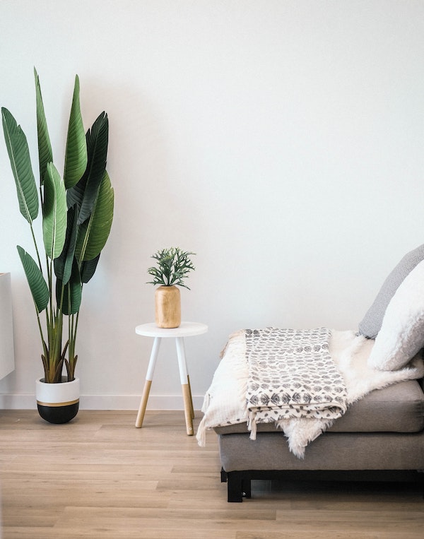
But you definitely need to have a good understanding of color before you get started, and a little research can go a long way! Did you know that darker colors actually absorb light, meaning painting a dark color on the wall of small space can make it feel even smaller? On the contrary, using lighter shades of whites and grays has the opposite effect. They tend to reflect light, helping to brighten up a space and make it look larger.
If you’re looking to incorporate some pops of color into your design scheme, experts suggest using splashes of color where more neutral colors are predominant. While you can certainly use paint to achieve this, home decor is a less permanent way to incorporate more color. Think of things like throw pillows, painting your headboard, installing a colorful backsplash in a kitchen or bathroom, framed art, etc.
At Dahl, we have a list of colors that we gravitate to for our jobs, and for good reason! These Sherwin Williams colors fall squarely into the neutral color palette that allows our clients to pick-out pops of color to accent them. Here’s a closer look at some of our favorites!

Mindful Gray: Nearly a perfect greige color (a mix of gray and beige), Mindful Gray is ideal for use in a family room, kitchen, or master bedroom. It is about as neutral a color as they come with a warm/cool base that complements almost any pop of color.

Repose Gray: If you’re looking for a wonderful neutral gray, Repose Gray is the winner! It is super versatile, making it a great option again for a family room, kitchen, or master. We find that it’s a great mix of gray, brown, greige, and even a slight hint of purple, which helps it not to fall flat.

Alabaster: More often than not, stark white paints are a bad choice for the interior of your home. They can be way too harsh and blinding, so you need to choose something more subtle if white is your neutral of choice. Enter Alabaster. The soft, off-white paint color works so well in family rooms, kitchens, and master bedrooms because of the neutral beige undertones. It’s soft and creamy, making it a lovely backdrop for your personal touches.

Sea Salt: When you think of neutrals, blue might not be the first hue that comes to mind. But one of the most popular home paint colors falls right in that family: Sea Salt. Shades of blues, greens, and cool grays mix together to create this masterpiece. It’s slightly moody and works amazingly well in all bedrooms and your dining room.

Underseas: If you’re looking for a darker neutral color for a powder bathroom or dining room, you should definitely take a look at Underseas! It is a wonderfully balanced blue, green, and gray neutral that breathes life into any space. Because it falls on the darker end of the spectrum, it is best used in smaller areas where drama is the objective.

Alpaca: Another greige, Alpaca, is a lovely choice for your family room or master bedroom. This color has more warm brown tones in it, but also has a hint of violet that helps balance it out. It works really well on walls, but also as a trim color too.
For assistance with your custom home building needs in the Marion, Cedar Rapids or Iowa City area, please consider Dahl Custom Homes! We are experts at custom home construction and would love to discuss your project in more detail.
Sorry, the comment form is closed at this time.