08 Nov Use Of Dark And Light Spaces In Your Home
If you fit the statistics, you’re likely drawn to making spaces in your home light by using illumination and light or bright colors. It’s not often that you’ll hear someone say, “I want this room to be as dark and dismal as possible.” But something you may not have considered, Using opposite ends of the light-dark spectrum results in drama, depth and visual interest and does not always necessarily make a space more dark. This concept of light and dark interplay can be effectively used in both exterior and interior areas of a home.
Let’s start by looking at the impact of light and dark on their own. “Dark” can be used to describe a space with little light or many shadows and can also be used to describe the shade of paint or pieces. Generally speaking, dark, bold pieces give a more traditional, regal impression and working in shadowed areas in a room can create a cozy, dramatic mood. Dark colors also stand out and are a great way to draw attention to something special. Words like elegant, moody, sophisticated, and chic are often attached to darker hues.
When it comes to “light,” you’re looking at actual lighting from a fixture or the sun as well as light-colored paint or pieces. Adding white or light-colored furniture can make a room look more spacious, open, and airy, and painting walls or cabinets white creates a blank palette which can allow for creative, colorful accents.
So how do you use this knowledge to make the most of light and dark in collaboration in a space?
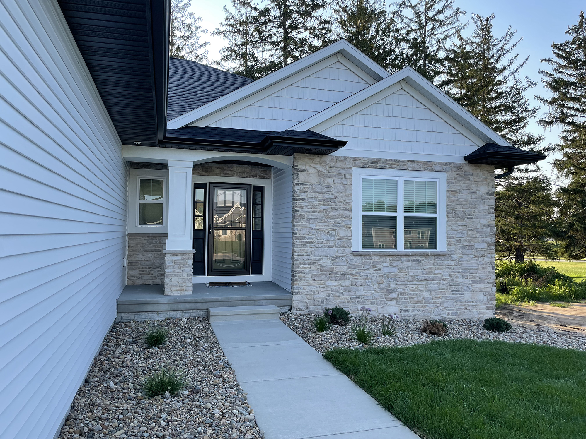
External Design
Here are some ideas for playing with light and dark in the exterior of your home design:
- Architectural elements painted black naturally appear recessed, while white areas tend to come forward
- Painting a roofline a dark color makes it more pronounced, since the dark color stands out against the light sky.
- Painting a door black when it sits within a white wall draws attention to it.
- Dark window frames look striking against white walls
- Dark elements overhead and bright ones below play with visual perceptions of heavy versus light
Interior Design
The 80/20 rule
The most simple way to approach light and dark in interior design is to incorporate 80% light elements and 20% dark elements. One simple way to do this is by using a light paint on the walls and trim, have light floors and large furniture and then use dark elements like shelves, smaller furniture (like ottomans and end tables), and textiles as accents to bring attention to various areas of the room. Nothing is more striking in a bright room than a dark bookshelf and overstuffed chair highlighted with a bright reading light.
Floors and ceiling
You can also use the 80/20 rule with a dark accent wall and dark floor elements for an even more striking dramatic effect. And don’t forget the ceiling. A bold use of dark floors and ceiling will accentuate white walls and furniture. Additional dark elements further exaggerate the dramatic contrast.
Natural light
When planning the design of your home, keep the sun in mind. Skylights, placement of windows, height of windows and how to use them to their best effect are all things to keep in mind.
When planning the design of your home, don’t forget the dark!
The team at Dahl Custom Homes is here to help you with any and all of your Corridor custom home needs, so please don’t hesitate to contact us if we can answer any questions or provide you with more information.
Sorry, the comment form is closed at this time.